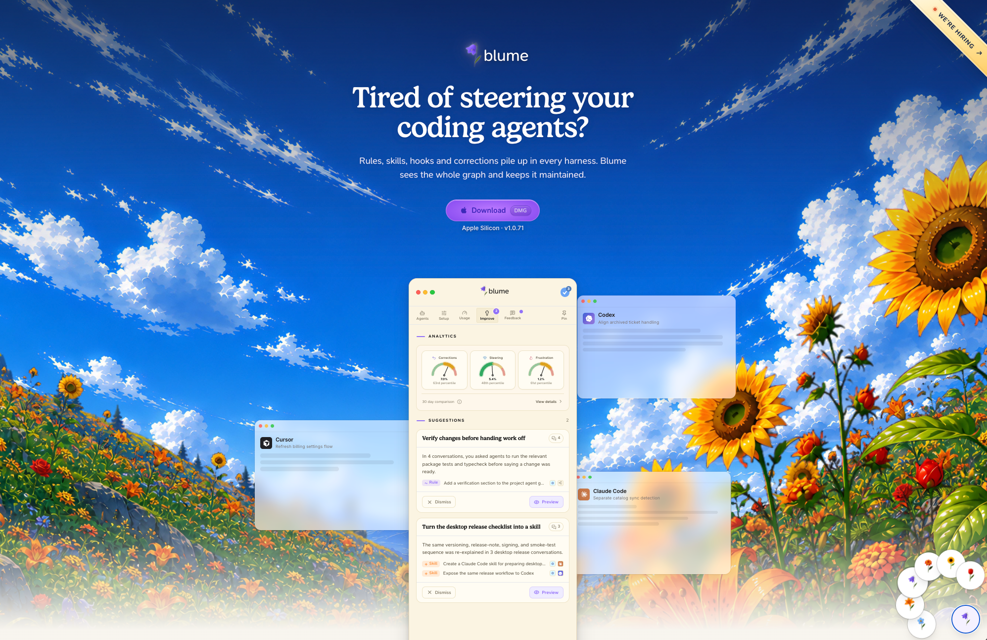
Building beautiful websites is easy now, but it wasn’t always like this. In my first company this was a perpetual frustration. We hired expensive agencies and designers who spent months building something that today I could get from Claude in the span of my coffee break.
Problem solved right? Not really.
Attention is zero-sum. This is my core design philosophy. In product design, if you make one button red it stands out, if you make them all red none of them do. This also applies to marketing. What was great 3 years ago is barely adequate today, the standard is simply higher now. If you want to stand out you need to up your game.
A little introduction of myself: My name is Olav, I’m a designer/engineer with 12 years of designing and marketing products. I started my first company in 2020, Modulize, then went on to be the first designer and technical employee in Wordware, which notoriously took down Product Hunt and became Product of the Year in 2024. We started Blume in 2025 originally as a landing page builder with automatic content updates, before we pivoted to being the agentic coding control plane.
High-quality landing pages have always been a passion of mine. I think that is reflected in blume.codes.
The goal isn’t simply to convince, but to amaze. You want the audience to engage with your site thinking “Wow, this is something else”. To help you with this, I will share some of the elements that make blume.codes unique, how we built them and how you can build similar effects. More importantly though, I will try to talk about our process for coming up with unique ideas that make you stand out in the crowd. While we don’t encourage 1:1 imitation, we would love to see more creative and beautiful websites with cool ideas. Hopefully the ideas you come up with are even better than ours.
So let’s go through it. If you haven’t already, now is a good time to simply scroll through blume.codes and see for yourself. Take a minute or two to do so before you continue reading. See if you can spot the four elements that make the site feel uniquely alive.
So, the four specific ideas I want to highlight are
- The hero parallax-effect
- The fully interactive product “screenshots”
- The flowery “journey” vector line
- The flower theme picker / switcher
I’ll explain what each element does, how we built it and why it belongs on the page.
Parallax Hero
When you first visit blume.codes you see an epic landscape filled with flowers. In the first iteration, this felt flat and boring. The obvious solution was depth. Parallax is nothing new, but parallax effects aren’t super easy to build, so I’ll mostly focus on the “how”.
How we Built it
What you need: A codex subscription
Why Codex? Because Codex can both code and generate images. If you prefer, you can use a different harness like Claude Code and give it like a fal.ai API key, but I recommend Codex for this task.
Here are the steps:
1) Define your aesthetic
Prompt your codex agent with the vibe. Our prompt was something like “epic landscape filled with flowers, in a Makoto Shinkai modern anime aesthetic”. I also attached our flower logo images so that there would be consistency. After some iteration, I landed on this as our reference image.
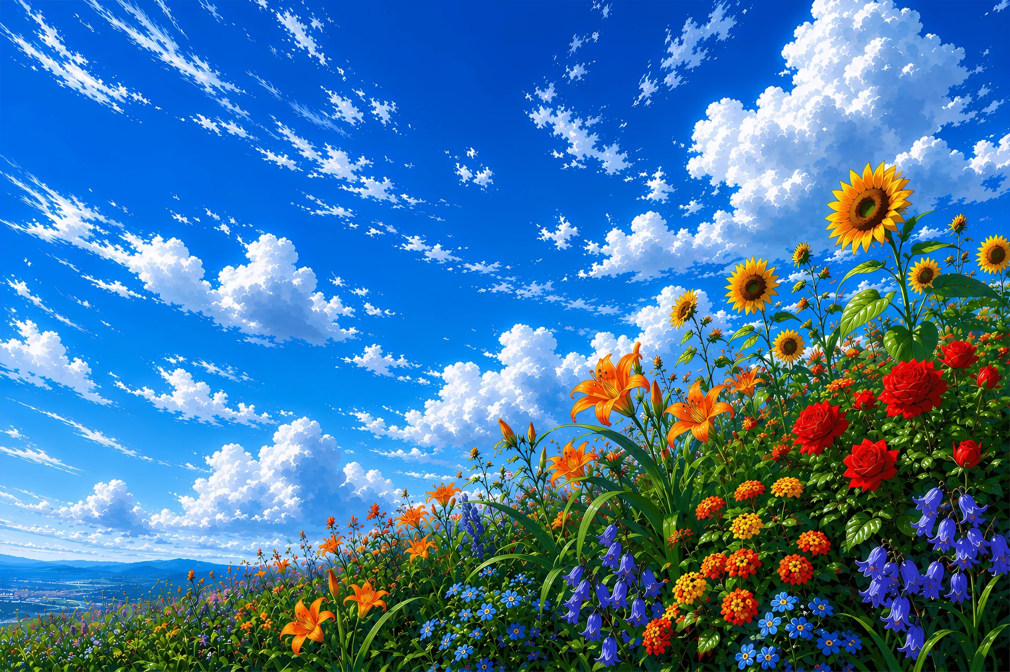
This is good because it has natural depth, fits with our brand, and it’s beautiful.
2) Figure out the layers
You should have a minimum of 3 layers to achieve the effect. Because of the innate depth in our reference image, we ended up with 7 layers. Here is an example:
base layer: sky and far away mountains
mid layer: grassy hills with flowers
front layer: in-focus flowers
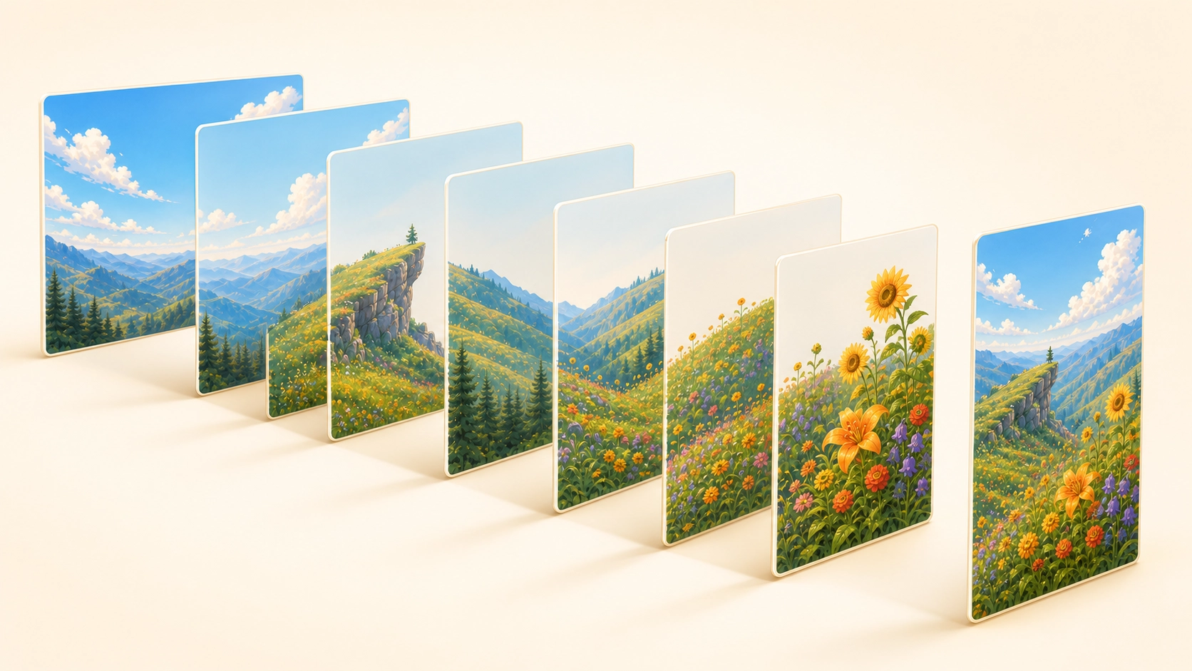
3) Let Codex rip
Give your reference image and layers to Codex with this prompt:
Create a parallax effect for our landing page's hero based on the reference image, with
Create a hero section with a parallax effect based on the reference image, with these layers:

<layers>

Do not read code or anything from any other projects; just create this as a test.

Follow this process:

Generate every layer separately using built-in GPT image generation. Include the reference image in every generation request and explicitly require the same visual style, lighting, palette, and perspective across all layers. Request genuine alpha transparency for the mid and front layers—never magenta/cyan backgrounds. Verify the saved files actually contain transparent pixels and do not contain a simulated checkerboard. If native transparency fails, use a neutral background and a proper background-segmentation or mask-extraction tool. Inspect the result against contrasting backgrounds and remove any halos or borders before using it.

Composite the layers in the hero so the base layer is fixed, and the closer a layer is to the camera, the faster it parallaxes on scroll. The direction should be opposite the scroll direction. Structure the code so it is easy to modify each layer’s speed, depth level, Y-offset, and overscan.

The hero’s height should equal the viewport height. The bottom 20% should be a gradient into the color of the section below. Temporarily disable this gradient while checking for issues, but restore it in the presented version.

Test the effect in the browser by scrolling through the page. Look for:

Gaps beneath moving layers. Ensure every generated layer includes sufficient artwork below the initial viewport.

Unnatural scroll speed. Make sure the depth-to-speed ratio feels correct, then ask the user specifically about it after presenting an iteration.

Layers that are never visible. Give every layer a recognizable landmark and confirm it remains visible during the animation.

Halos, colored borders, checkerboard remnants, or inconsistent styles between layers.

When you cannot identify more issues, ask the user for input and iterate with them.

When the user thinks it is good, upscale the approved layers with GPT image generation—again including the reference image in every request—and produce the final version.
From here, iterate until it feels good to you.
Why it works
The parallax effect turns the flowery landscape from a background into a world that our visitors enter. It provides the immediate “wow”, makes the site memorable and thematically rhymes with our brand. It’s not an arbitrary effect, it feels consistent, and last but not least, it rewards the user for scrolling.
Interactive Product Demo
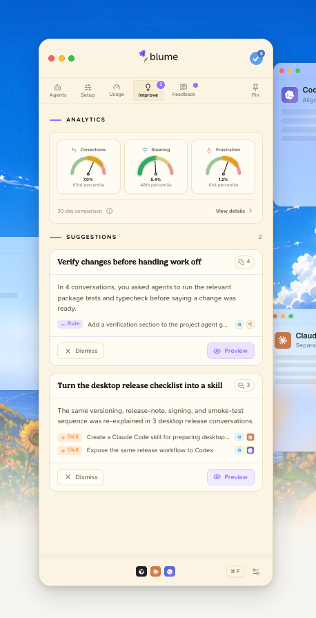
You have to show your product on your site, but if you are a start-up, your product is hardly static. Screenshots will go stale every week. Keeping it up to date becomes a game of catch-up.
When we push design changes to the Blume app, the landing page automatically updates too. But even more interesting is that the Blume app on our site is actually a fully interactive representation of our product, shown with mock data. Users can get a good feel of how the product works before they download. How did we achieve this?
How we built it
Simply put: We have a Turborepo setup where the electron app is a thin shell with only electron-specific code. The UI and business logic is fully encapsulated in reusable packages.
Our landing page and electron app are both contained in this mono-repo, and consume the same UI package. That’s it.
Getting there was a bit of a challenge though. We didn’t have the foresight to focus on the architecture from the get-go. This might seem unbelievable, but it’s true: Codex ran a week-long /goal task to refactor our repo for this purpose. This made sense for us to do because it also unlocked browser-based testing of our app, but in the end the landing page was an equally large unlock.
Why it works
A visitor simply wants one question answered: “Is this product for me?”. They want to know if the friction of downloading the app is worth it. From our point of view, we only want users who actually want what we are offering. This way, we both win.
Sprouting Vine
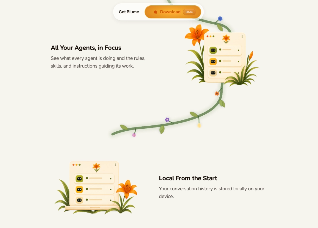
As you scroll past the hero section, you will see a growing vine with sprouting flowers, leading you through the Blume user journey.
How we built it
- A vector line is drawn through a pre-defined path on scroll.
- Flower crowns are generated on the spot using a custom Dicebear style.
- The crowns are seeded using the current date, making them change every day.
This is the smallest and simplest feature that contributes to the overall feeling of the site.
Why it works
The vine rewards users for scrolling further. My mental model is the site should work like a song. Each part should flow into the next, every section should fulfil a purpose. Once the flow stops, they leave. Don’t give the audience the chance to get bored.
Flower Theme
One recurring theme in Blume is our 6 flowers. In the Blume app, you can use whichever theme you prefer. We wanted to have the same experience on our landing page. This is what we ended up with:
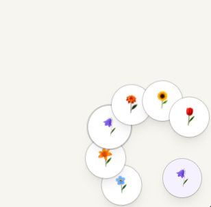
As you can see, there is full page consistency. If you have ever implemented a dark mode toggle into your app, you already know most of it. The way we took it one step further is by making sure the theme was more broadly used, even in images. We provided the source images for each flower, and generated new versions of all the page graphics for each theme. That’s it.
This is an aspect of the site we intentionally kept somewhat hidden. We don’t want to force it upon visitors, it’s separate from the flow, it’s more of an easter egg. It’s even possible to set the page level theme by clicking into settings in the app demo. This is what high quality architecture enables.
Your Turn!
Thanks for reading all the way to the end! I hope you got some new ideas for how to step up your site to the next level. The next step now is asking yourself:
- Will my audience say “wow” when they visit my site right now?
- What are existing elements that with small changes could give such an effect?
- What are thematic elements in our brand that we can use? For instance, if your logo is a UFO, could it be used throughout the page somehow? If you are geo-based somehow, could you style the site dynamically with elements from the user’s country?
- What are features or experiences the user will have with your product that you could expose on the site in a way where the user gets a real understanding of the value?
Keep iterating, and good luck!